
Top in bright red curated for Bright Spring. Trend-led staples and statement pieces updated weekly.
This may be an affiliate link. We may earn a commission.

Why it works
This top has the vibrant clarity that Bright Spring wears so well. The red shade is saturated enough to match your natural vibrancy without tipping into harshness. This red works beautifully with Bright Spring's complementary tones. Try pairing with light espresso, warm navy, clear camel, and ink for balance, or jade green, clear aqua, bright peach, and hot coral for a more dynamic look.

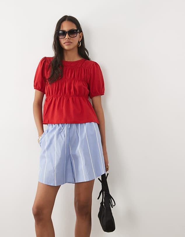
Top in bright red curated for Bright Spring. This page gives you the same information as quick view, but on a dedicated URL that can be linked, shared, and indexed.
This may be an affiliate link. We may earn a commission.
Why it works
This top has the vibrant clarity that Bright Spring wears so well. The red shade is saturated enough to match your natural vibrancy without tipping into harshness. This red works beautifully with Bright Spring's complementary tones. Try pairing with light espresso, warm navy, clear camel, and ink for balance, or jade green, clear aqua, bright peach, and hot coral for a more dynamic look.